colored pencil
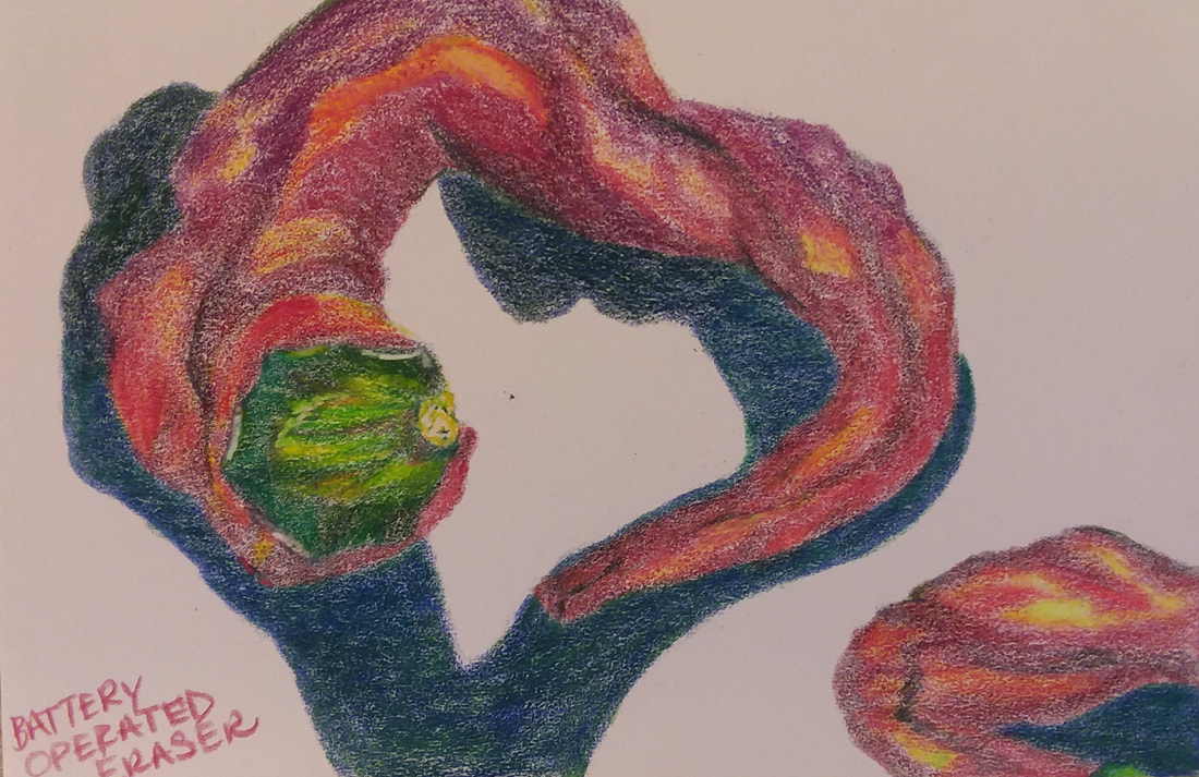
This was a piece I did in class. I used colored pencils and sticks on pink suede paper. I also used the battery operated eraser for the high lights.
I loved observing the peppers, I had been looking forward to drawing them for weeks. I used the Bull's Eye composition format because it was an obvious choice for this particular pepper's shape. I tried to be conscious of using different tones of red as I worked further back in space (the wine colors towards the back versus the red-orange colors towards the front). The electric eraser ripped into the suede paper (the paper was far too delicate and I should've known better) when it rotated which wasn't cool. Now that I've experimented with other kinds of paper I realize that this probably isn't the kind of paper I would personally use with this medium. Colored pencils need a sturdy surface with all of the layers and hard wax.
Overall, I was pleased with this work. It seemed like my classmates enjoyed it as well. Many said it looked "almost abstract" from a distance, which doesn't bother me.
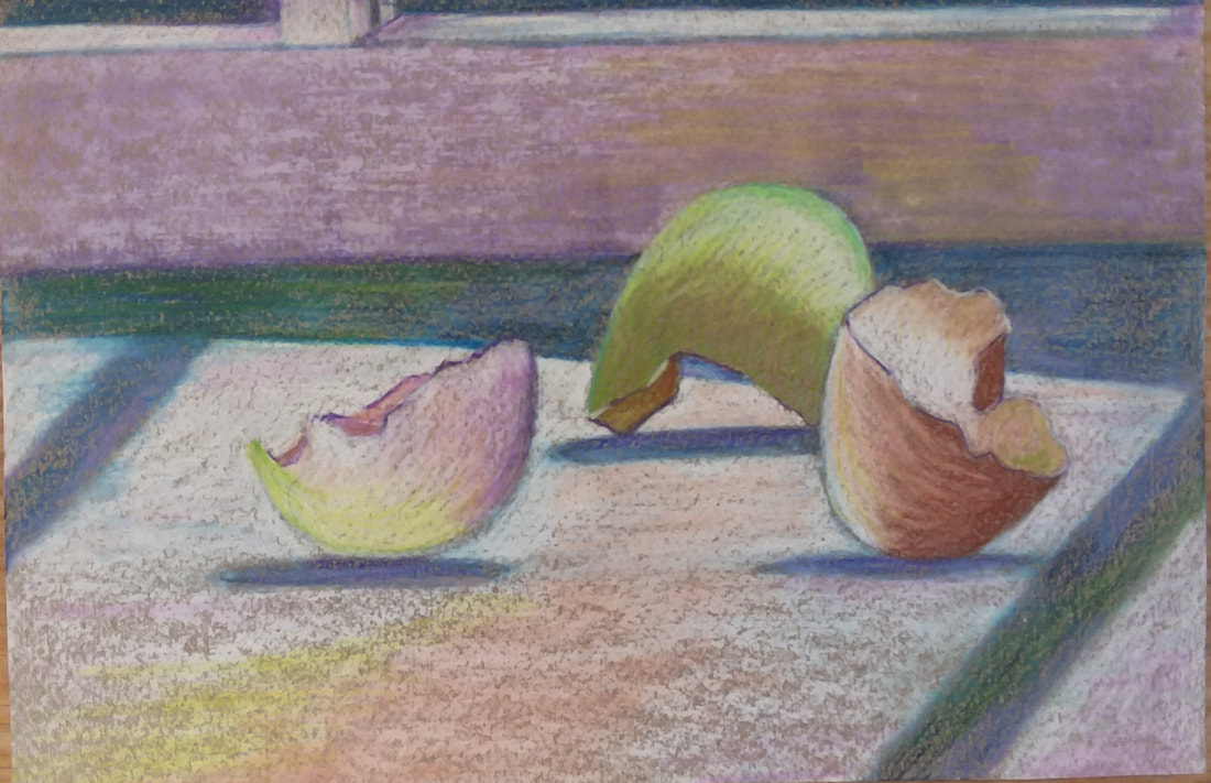
This was a piece I did in class. I used colored pencils and sticks on dark gray paper that had a slight tooth.
I wanted to work with the egg shells the moment I saw them. I love the symbolic nature of the egg. By mid-afternoon the light was perfect for pastel, jewel tones which matched the egg shells perfectly. I used several composition tricks: clustering, triangular, rule of 1/3's, leading lines. I am not sure if the over-saturation of wax on the paper is appealing. I like it, but I think that people think I am scumbling over the paper when really I think the paper has started to reject the wax. (I find that I do this with pastels as well. I'm not sure how I am doing it, I thought it was a mistake, yet this is the 2nd instructor I've had that has liked the effect.)
Kathleen liked this piece, so did many of my classmates. It was fun to play with color and move it around with her rule of 3's (use color at least 3 times and preferably in a triangular pattern).
This is a piece I did at home. I used colored pencils and sticks on gray paper that had a slight tooth. After all of the coloring was done I used a baby wipe all over the background, then the foreground. The change was super subtle, but I really enjoyed it. I touched up the highlights after I used the baby wipe.
This was probably my favorite piece.
This was probably my favorite piece.
This is a piece that I did at home (my husband bought me daisies for my birthday). I used Derwent Inktense watercolor pencils, color pencils, and sticks on dark gray sandpaper (600 grit). The first photograph shows the "flavoring" I did with water and the watercolor pencils (purples, pinks, outlined foreground with yellow). The second photograph shows the first layers of colored pencils (whites, lavenders, greens, etc.). The third photograph shows the finished work after the last layers of colored pencils (ivories, yellows, purple and pink sticks in the background) and the sgraffito (fine scratching between the petals).
I love the daisy on the left-- it is spontaneous and easy, the colors are bright and light. I dislike the daisies towards the right, they aren't sitting well, they are awkward and out of place. I really enjoy the leaves and stems though-- I'd rather have done a composition just with the leaves and stems. The colors are so vibrant!
I love the daisy on the left-- it is spontaneous and easy, the colors are bright and light. I dislike the daisies towards the right, they aren't sitting well, they are awkward and out of place. I really enjoy the leaves and stems though-- I'd rather have done a composition just with the leaves and stems. The colors are so vibrant!
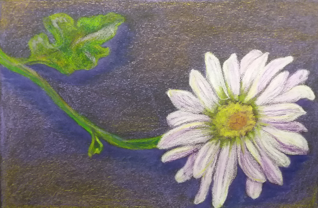
This is a piece I did at home. I used colored pencils and sticks on dark gray sanded paper.
This was the first thing I did after class. I love the colors and effects of the purples, greens, and yellows. I really enjoy the scumbling in the background contrasting the burnished purple shadows directly under the flower. The blossom is weak, however. The white petals don't look relaxed or easy. The center isn't awful, but the petals seem, again, contrived and awkward.
This was the first thing I did after class. I love the colors and effects of the purples, greens, and yellows. I really enjoy the scumbling in the background contrasting the burnished purple shadows directly under the flower. The blossom is weak, however. The white petals don't look relaxed or easy. The center isn't awful, but the petals seem, again, contrived and awkward.
